
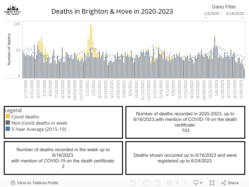
This graph shows the:
- number of deaths of Brighton & Hove residents where COVID-19 was recorded on the death certificate (yellow)
- number of deaths with no mention of COVID-19 (grey)
- average number of deaths for the equivalent weeks in 2014 to 2018 (blue)
The blue lines are included so that we can see if there are more deaths this year than on average
Where this information comes from:
This data is published by the Office for National Statistics.
Caveat:
The data is shown by the week in which the death occurred, and include deaths registered up to eight days after they occurred (the date on the chart indicates the week ending on that date). This means the numbers are revised if more deaths are registered later which occurred in previous weeks.